Podcast cover art is the small, square image that represents your podcast next to its title, similar to how an album cover depicts a record. It’s the first visual potential listeners see when browsing for new podcasts. Your cover art serves as the face of your podcast—it’s the visual identity that sticks in your audience’s memory.
A strong, well-designed, tested cover art will have a significant impact on conversion (from “seen” to “clicked”) and will entice potential listeners to click and start listening.
Furthermore, the role of the cover art is all the more critical when listeners searching for non-branded terms. When a potential listener is still undecided, quality cover art can be essential in making that choice
1. Minimize the amount of text or elements
When it comes to podcast covers, less is more. Overcrowded visuals and small text confuse your audience and make it harder to capture attention. Keep it clean and focused to draw listeners in.
Too much text or cluttered graphics make your podcast look messy and less appealing. Avoid designs that distract rather than attract.
A strong cover should instantly convey the essence of your podcast without overwhelming viewers with details. It’s not just about aesthetics—it’s about making your podcast stand out and get noticed by potential listeners. When in doubt, simplify.
The examples below show poor designs, which are overloaded with unnecessary graphics and text. These are common mistakes to avoid.

2. Think podcast, not radio
Podcast covers should follow podcast codes, not radio ones. A common mistake is including broadcast times or reusing visuals from a radio press release. These elements don’t fit the on-demand nature of podcasts and can confuse listeners. Mentioning that a show airs live every weekday at 5 p.m. offers no value in the podcast world, where listeners tune in whenever they choose.
Another misstep is overemphasizing the host’s face. While it may add familiarity if the host is a household name, the primary focus should always be communicating the podcast’s theme.
At Audiotiq, we’ve seen countless cases where managing the egos of radio presenters leads to status quo and sub-optimal covers. If the famous morning show host has her face on the podcast cover, why shouldn’t the less famous midnight presenter demand the same?
The critical question is: ‘Is this show personality-driven or content-driven?’ If the host is recognizable and drives the show’s success, their image can attract listeners. However, if the focus is on the content, a cover that reflects what the podcast is about will be far more effective.
And let’s not forget: having broadcast frequencies on your podcast cover is useless. Podcasts are not tied to traditional frequencies—they’re on-demand, accessible from anywhere at any time.

3. Stand out from competitors
When designing your podcast cover, it’s crucial to research your competition and ensure your cover stands out from the pack.
As the podcast landscape becomes more crowded, especially within specific niches, a unique cover helps attract potential listeners.
The key is balancing relevance to your podcast’s theme while incorporating visual elements that set your show apart from others, making it instantly recognizable and memorable.
In the example below, for the pregnancy niche, most covers tend to show a rounded belly in black and white. The last one on the right stands out by its colors.

4. Associate with your brand
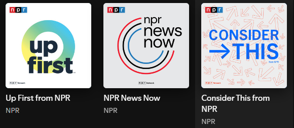
Your podcast cover should align with your brand’s identity to build recognition and trust, whether you’re a media outlet or a non-media brand. Colors, fonts, and logos used on the cover must match your brand elements, making the podcast instantly recognizable, just like the cover art from NPR and Babbel below.
Consistency across all platforms strengthens your brand and helps listeners recognize your podcast at a glance, making it easier for them to trust its content before engaging with it.


5. Follow the guidelines
Designing your podcast cover art may seem straightforward, but it’s essential to follow the specific guidelines of each platform to ensure your cover displays correctly across directories.
Like mobile app icons, podcast platforms have standards that must be met. Luckily, for both Spotify and Apple Podcasts, your cover art should be squared and 3000 x 3000 pixels.
Apple has extra requirements for the content they will promote (at their own discretion, of course), and the needs vary between full-page show art, channels, hero section, background, etc.
The platforms distribute your content. They have guidelines. You need to follow those. Period.
6. Size matters…a lot
Your podcast is often seen as a small icon on platforms like Apple Podcasts or Spotify. This holds true even on a computer, but on a phone screen—which is how most listeners view it—the icon appears even smaller. That’s why your podcast cover art must remain clear and recognizable when scaled down to thumbnail size.
To test this, reduce your design to about 55 x 55 pixels as a JPG file. Ensure key details, like the title or logo, are still easy to read at that size.
7. Consider adaptability
Your podcast cover art is more than just for the podcast platforms. When promoting your content, you are likely to repurpose it for social media, newsletters, your website, and even print.
So, designing with versatility will allow recognition and amplify your promotional efforts.
8. Test your cover art, and then test it again
Testing your podcast cover art is crucial for success. Sometimes, the cover you least expect can drive the best results.
Since platforms like Apple Podcasts and Spotify currently don’t offer any A/B testing possibility, a panel test is the most effective way to test cover art.
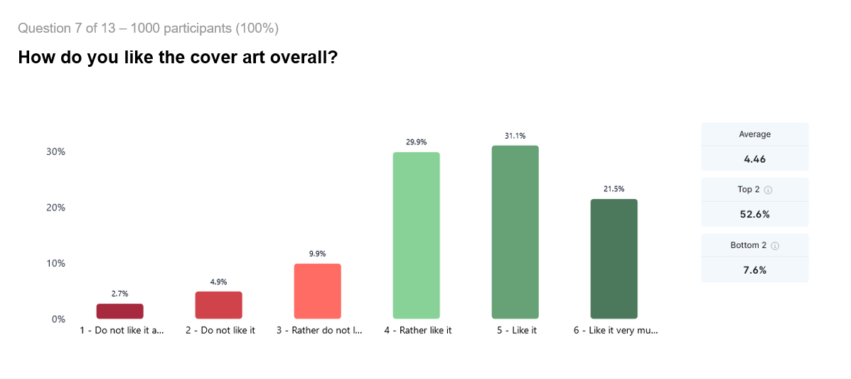
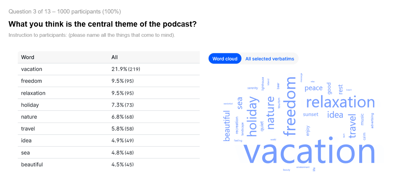
Panel testing goes beyond just measuring clicks—it provides valuable feedback on how your cover is perceived across different demographics, such as age and gender. Those deeper insights ensure your cover resonates with your target audience and maximizes engagement.
Our team at Audiotiq has seen icon tests improve app downloads in the mobile world by more than 10% and in the podcast world by 29% after four iterations. This is a benchmark good enough to seriously consider running a panel test for your cover art.


9. Bonus Point Track: Take advantage of seasonality
Keep holidays, events, and seasonal trends in mind. By incorporating themed visuals, you can benefit from that little boost in positive emotions in your audience and differentiate yourself from your competitors.
A good example is adding a Christmas flavor to your cover art around the New Year holiday. Mobile apps do this often to enjoy a slight uptick in downloads.
Here is what Subway Surfer does, for example.

Conclusion
Your podcast cover art is often the first thing potential listeners see, so making a solid impression is crucial. The cover should be visually appealing, clear, and memorable, especially in smaller sizes. An effective cover design will boost the ratio between potential listeners seeing and clicking on your icon, attracting more listeners.
Panel testing is essential to ensure your cover resonates with your audience and stands out in crowded directories. Panel tests allow you to gather valuable feedback from real listeners, providing insights into how different demographics perceive your design. This data-driven approach helps you refine your cover and maximize its impact, ensuring it truly connects with potential listeners.
